4 ways to use bar charts for comparisons
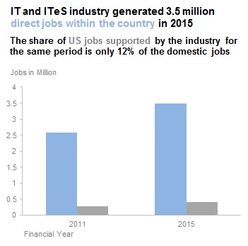
When I came across this graph in the Economic Times this morning, I thought to myself there are so many ways in which bar charts can be used for comparisons, but this right here is not one of them.
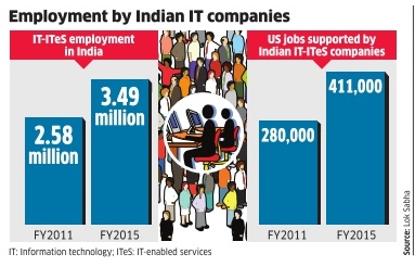
To compare 2 bar charts, they should have a consistent axis. 2.58 million is not equal to 280,000 in the real world and definitely not equal in bar chart world.
In this post, we will learn how to fix this chart and also learn 3 other ways in which we can show this comparison.
We will end this post with some learning on when to use which variation.
1. Side by Side Bar
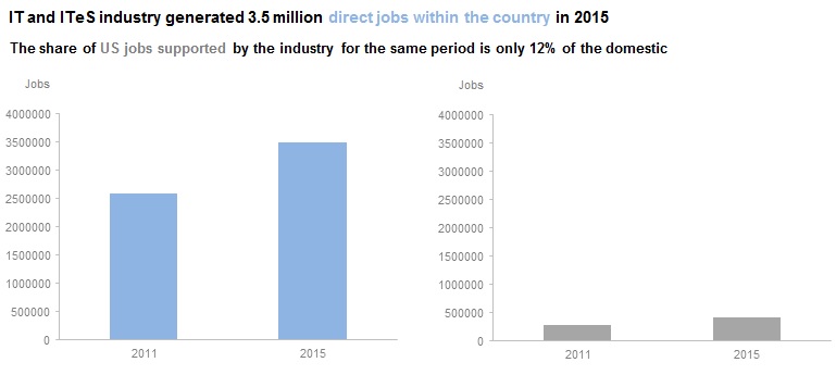
This is essentially the same chart as the original, but we have fixed the axis problem. Both bar charts now have a consistent axis.
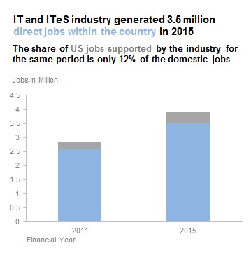
2. Clustered Bar
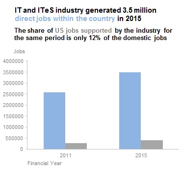 A clustered bar removes the redundant axis we had in the side-by-side bar. Since we have only 2 sets of bars here, this chart works well for comparison. If the huge numbers in the y-axis are hard to read, we can change the axis to millions.
3. Stacked Bar
A Stacked Bar is useful when we want to compare how one part did in comparison to the whole. The fact that domestic jobs constitute almost 90% of the jobs generated is clear from this chart.
If we want our audience to be able to read the exact number of jobs, we could modify the chart to include data labels. We can apply this trick to any bar chart.
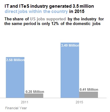 We have removed the y-axis altogether in this case as the values are already in the bars and we don’t want to show redundant data.
4. Logarithmic Scale
This does not have a lot to do with bar charts, but I wanted to include this here as it is applicable to this example in hand.
Let’s understand a logarithmic (log) scale before we use it in a graph.
Log scales use a base. The most common base is 10. The values on a log scale are calculated as previous value multiplied by the base. So if our base is 10, the values on the scale will be 1, 10,100,1000 and so on. Since the log scale is exponential, it allows us to represent both small numbers as well as large ones with great clarity on the same chart.
But there is one problem with a log scale in a bar chart.
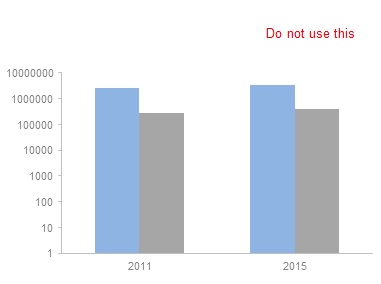
When we see bars, we compare the lengths of the bars. But when using a log scale, such a comparison is meaningless. The distance between 2 values in a log scale represents ratio and not value. That’s why bar charts are not the right visuals for a log scale. Let’s try to replace the bars with dots or lines.
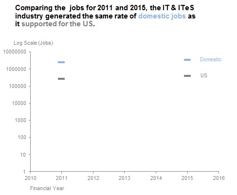
Much better.
The main use of log scales is in measuring ratios or percentages. In our example, if we want to answer the question, what’s the rate of domestic job increase compared to the US support jobs – the visual above gives us the answer. The rates are almost equal. It’s kind of hard to get that from a bar chart.
But, log scales are hard for the average viewer to understand. So use them with care and always explicitly mention and explain to the viewer that the scale is logarithmic and what it means.
Conclusion
This brings us to the end of this post. Hope you had as much fun exploring ways to compare values using bar charts.
In summary, this is what we discussed:
- When comparing bars side by side, they should have a consistent scale.
- Use a side by side bar or a clustered bar graph to enable comparisons of individual values.
- Use a stacked bar graph to highlight part to whole relationship. In this case, comparing individual values is not the intent.
- Use a logarithmic scale if your audience can understand it. Do not use bar charts with logarithmic scales. Replace the bars with dots.
- In a logarithmic scale equal distances are equal in Ratio not Value.
Do you use any other ways to compare values with bar charts? Let us know in the comments and if you have your own makeovers of this visual, please add a link to it too.
Thanks for reading!