MakeoverMonday : Energy Use at 10 Downing St in 2017
Original
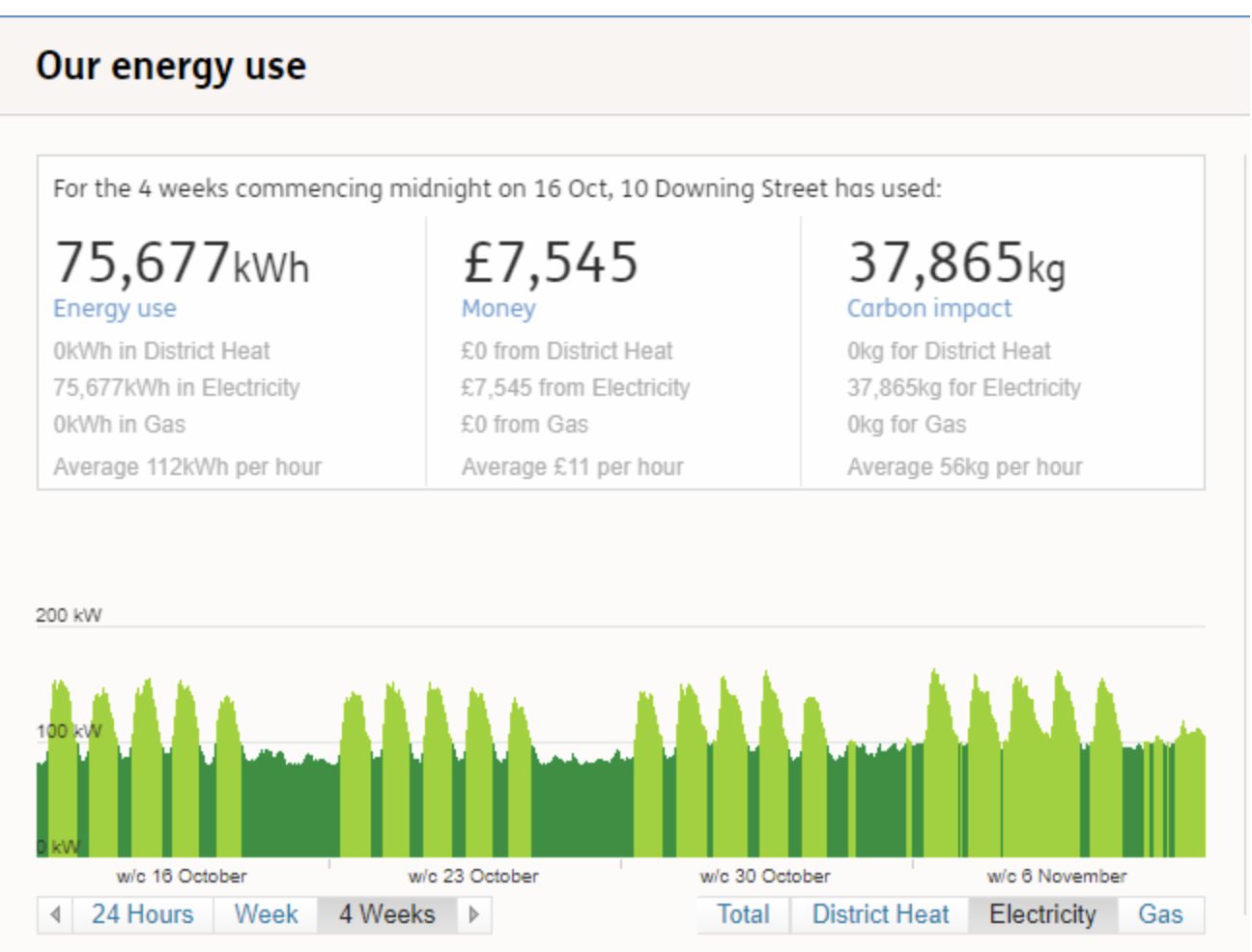
What works well?
- Good use of colors to indicate the operational rating.
- The tabs for 24 hours, weekly and 4 weeks energy use are nice.
- Good summary of numbers at the top.
What does not work?
- The colors are missing a legend.
- The x-axis could be better, especially for 4 weeks display.
- The district heat and gas tabs do nothing.
Makeover
For this week’s makeover, I wanted to use Tableau. Sketching a few ideas for the visualization, I was drawn towards a heat map. I started with a heat map of days vs. hour of the day. Exploring the data further, I found the monthly variation to be interesting.
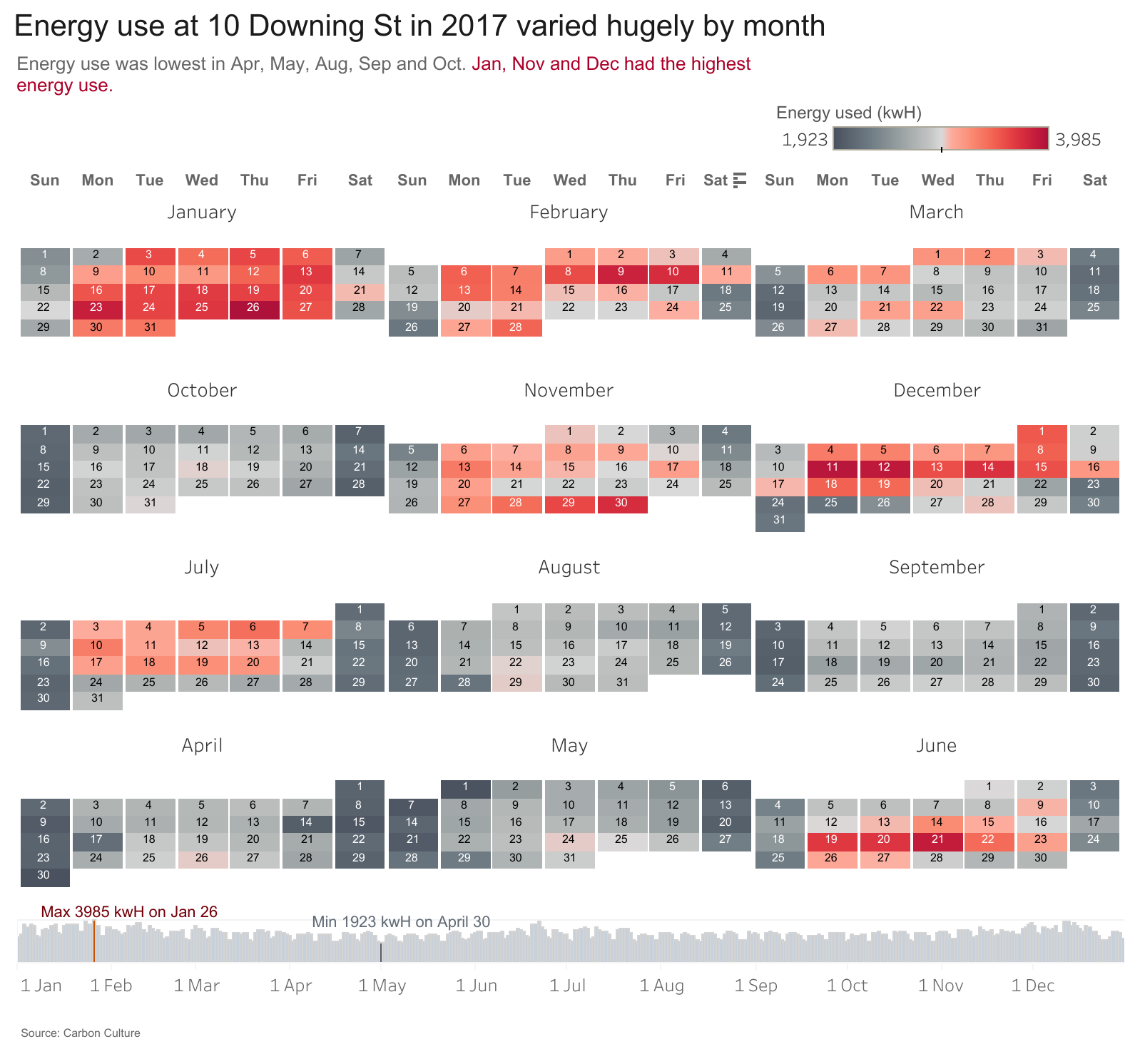
Here is an interactive version in tableau public.
You can download the data for this makeover here.
Resources
I used a couple of resources to get this monthly heat map working.