turn your data into visual stories people remember
Behind every chart lies a story. If you’ve ever wondered, ‘I understand this… but how do I show it with clarity?’ – you’ve come to the right place.
Data is powerful, but only when it’s communicated well. Here at Daydreaming Numbers, I help you translate complexity into visuals that make sense, spark understanding, and stay with your audience long after the meeting ends.
I’m Vidya, the designer behind Daydreaming Numbers. Here, I help leaders, analysts, and creatives turn complex information into clear, compelling stories. You’ll find practical techniques, visual makeovers, chart guides and step-by-step instructions that help you design with clarity and confidence.
start with what you need
Pick the path that best matches where you are right now
the daydreaming numbers approach
Data visualization isn’t just about turning numbers into charts.
It’s about designing for the human brain. Here you’ll find thoughtful explanations, approachable examples, and design principles that help you communicate better
recommended starting points
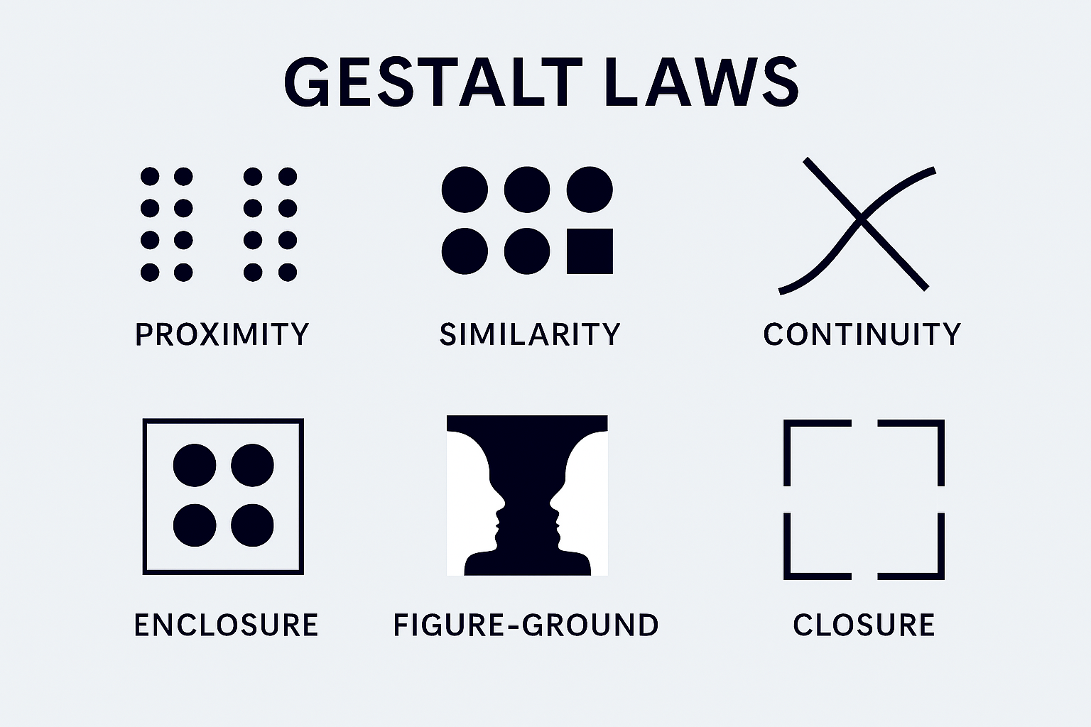
Gestalt Laws Applied to Data Visualization
How do we humans make sense of what we see from the chaotic stimuli around us? We seek to form patterns, group objects in particular ways and simplify complex images.
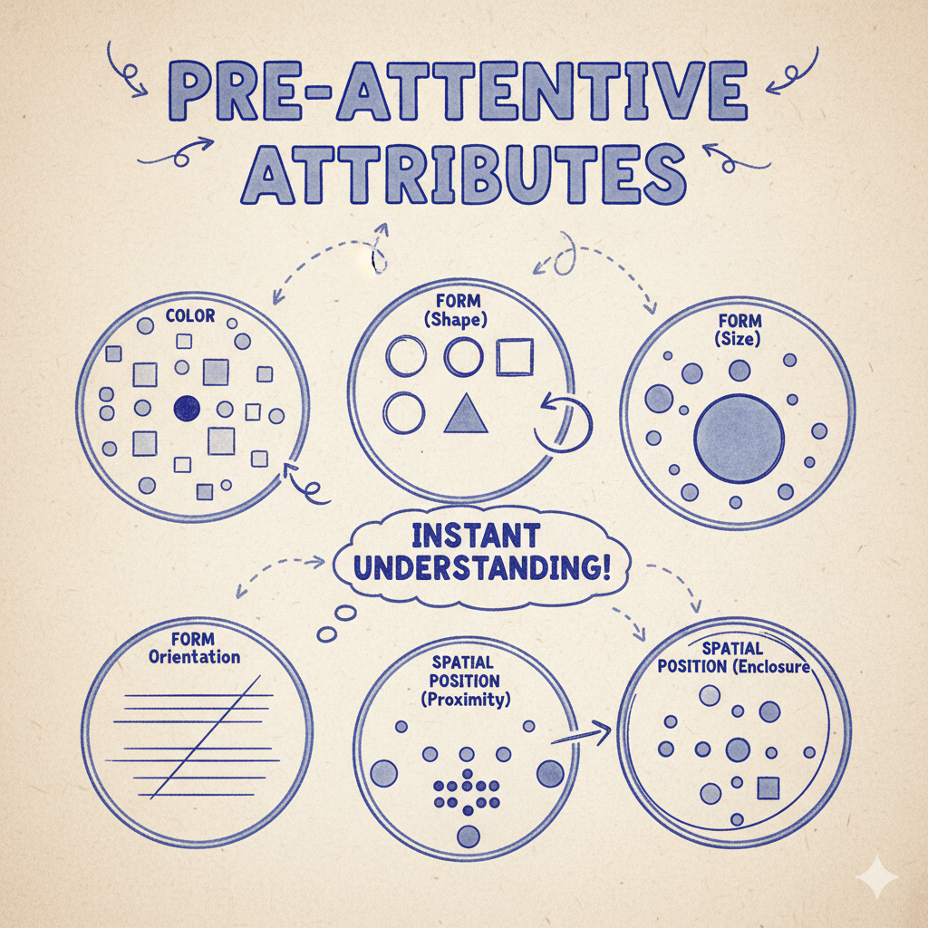
What are Preattentive Attributes
Preattentive attributes determine what information catches our attention. This enables us to direct our viewer’s attention towards the most important information in our visual.
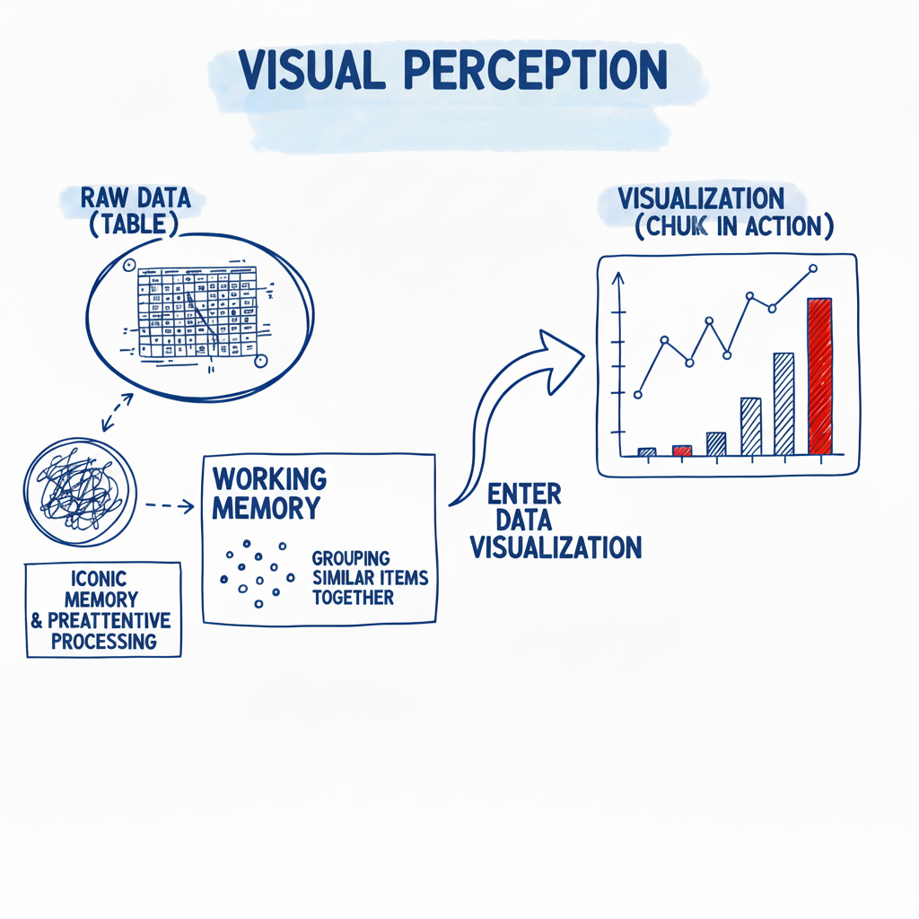
Visual Perception in Data Visualization
Why is it that we can understand complex information on a visual but not from rows of tabular data? The answer to this lies in understanding visual perception and a little bit about human memory.
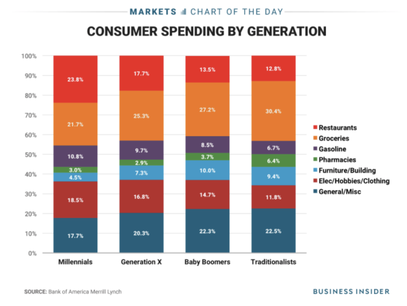
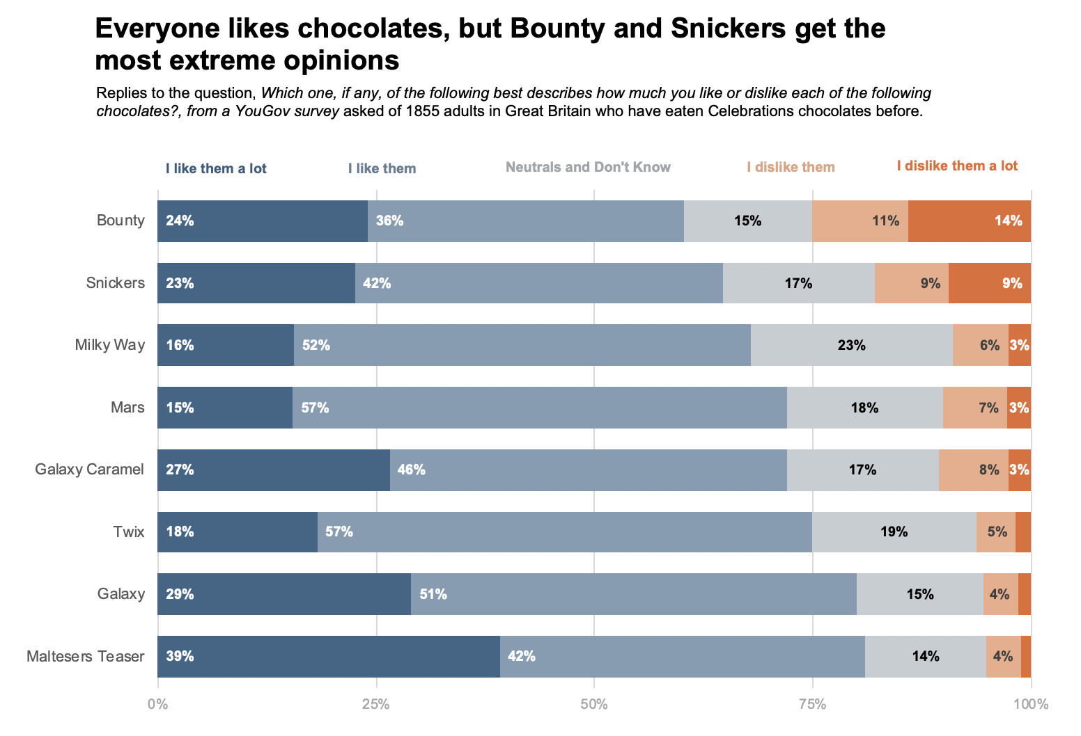
How to fix a multi-coloured stacked bar chart?
Stacked bar charts is are usually not very effective. When we use stacked bar charts it appears as if we are attempting to answer too many questions with a single chart