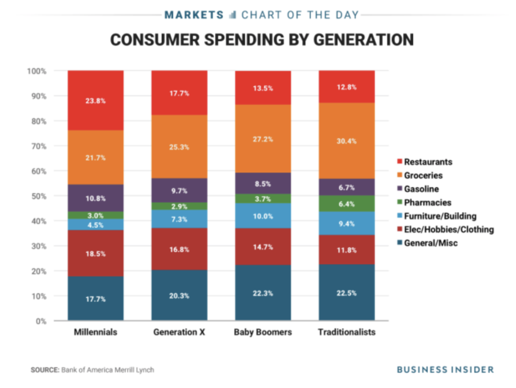
Original

Analysis of the original
Here are a series of questions I use to analyse a chart.
- Where are my eyes drawn?: My eyes are drawn to the red stack on the top of the bars.
- What works in this visual?: The legends are easy to read and in the same order as the stacks. The data labels on the stacks make the values easy to read.
- Identify clutter, make note of anything you find confusing: There are too many colors in the chart. The decimal precision on the data labels is unnecessary. The Y-axis is redundant given that the bars are labelled. The order of generations is reversed which is counter intuitive.
- Is the take-away action clear?: No, there is no take away action.
- Are pre attentive attributes used to draw user’s attention?: No, all the colors compete for attention.
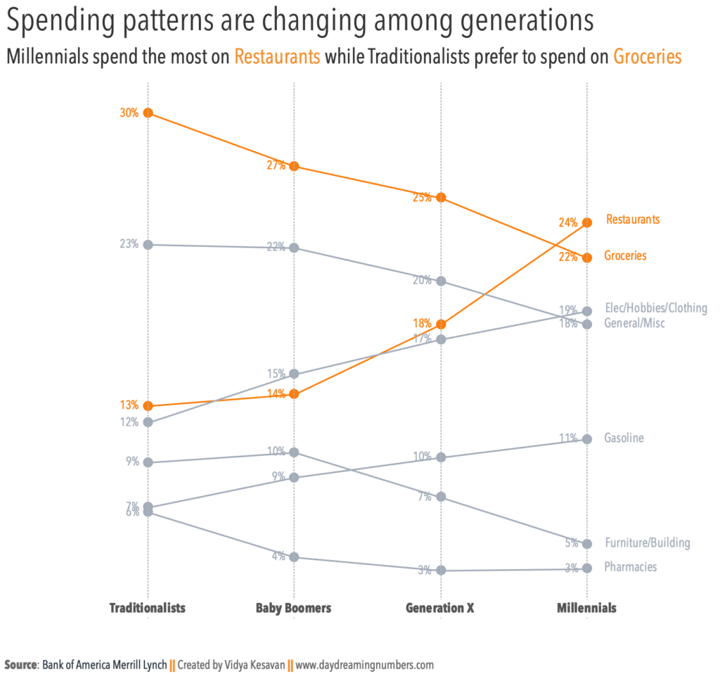
Makeover
With this makeover, I wanted to focus on answering the questions:
- How are spending patterns evolving among generations?
- Who spends the most on each individual category?
- What does each generation spend the most on?

I arranged the generations in chronological order, from oldest to youngest. I chose to focus on 2 categories: Restaurants and Groceries.
With this chart, it is easy to see which generation spends the most on a category. For example, it is easy to see that Millennials spend the most on Gasoline.
It is also easy to see what each generation spends the most on. For example, baby boomers spend the most on Groceries.
Tutorials and References
This is the tutorial I used to create the slopegraph in tableau: How to create slopegraphs in Tableau?
To get the vertical lines on the graph, I followed this tutorial: How to add vertical lines to slopegraphs in Tableau?
If you would like to create this slopegraph in R, here is a tutorial.
If you would like to try your own makeover, here is the data.

pnbltn
jseouy