Makeover Monday: Digital Economy and Society Index (DESI)
For this makeover, I used a dot plot to tell 2 stories. Which countries improved the most?Which countries have the highest and lowest DESI scores?

For this makeover, I used a dot plot to tell 2 stories. Which countries improved the most?Which countries have the highest and lowest DESI scores?
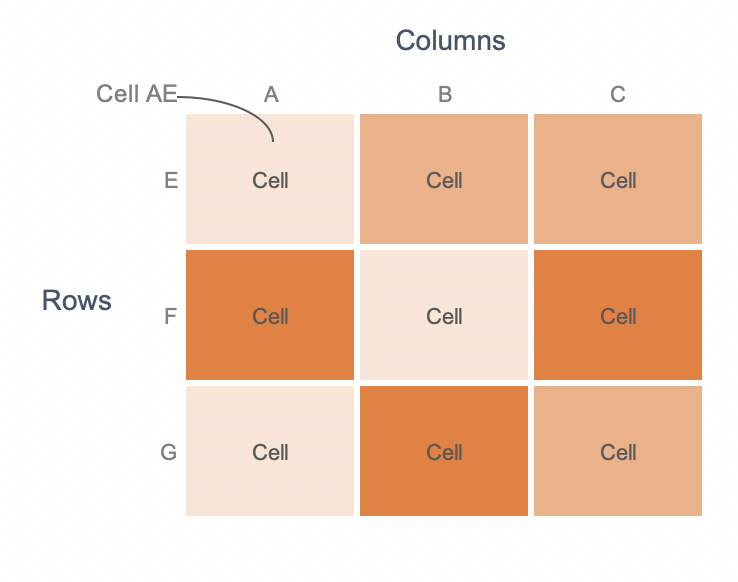
Heatmaps visualize data through variations in coloring. Heatmaps are self-explanatory and are a great way to show to a general view of data. Heatmap Framework Heatmaps consist of multivariate data plotted in rows and columns in a matrix-like fashion. Cell AE, for instance, is based on the relationship between cells A and E. When to…

For this week’s makeover, I wanted to use Tableau. Sketching a few ideas for the visualization, I was drawn towards a heat map. I started with a heat map of days vs. hour of the day. Exploring the data further, I found the monthly variation to be interesting.
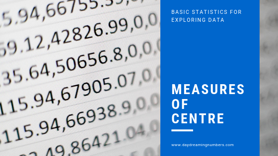
The famous statistician John W. Tukey created a branch of data analysis called Exploratory Data Analysis. In exploratory data analysis we get familiar with data, ask questions, visualize data in a number of forms, look for relationships between the variables, look for outliers, patterns and trends in data. One way to do that is using measures…
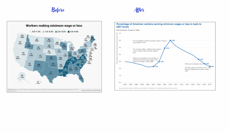
For this makeover, I wanted to practice annotations on charts. Annotations help our readers better understand the context and our argument with the graph. They can also help us highlight specific points and show readers what to focus on.

January 2019 SWDchallenge is all about going beyond our comfort zones – to make a visualization using a new tool. I make most of my visualizations using R, Excel or Tableau. For this challenge I decided to try Datawrapper. I am a huge fan of blog posts on Datawrapper. I have never used Datawrapper before,…

Original What works well? The map gives a good view of the state of global press freedom in 2017. The colors instantly show that most of Africa, South America, Eurasia and Asia do not have a free press. What does not work? The legend being an ordinal variable, a color saturation may worked better than…