How to use waterfall charts?
A waterfall chart is used to show how an initial value is increased and/or decreased by a series of intermediate values, leading to a final value.

A waterfall chart is used to show how an initial value is increased and/or decreased by a series of intermediate values, leading to a final value.
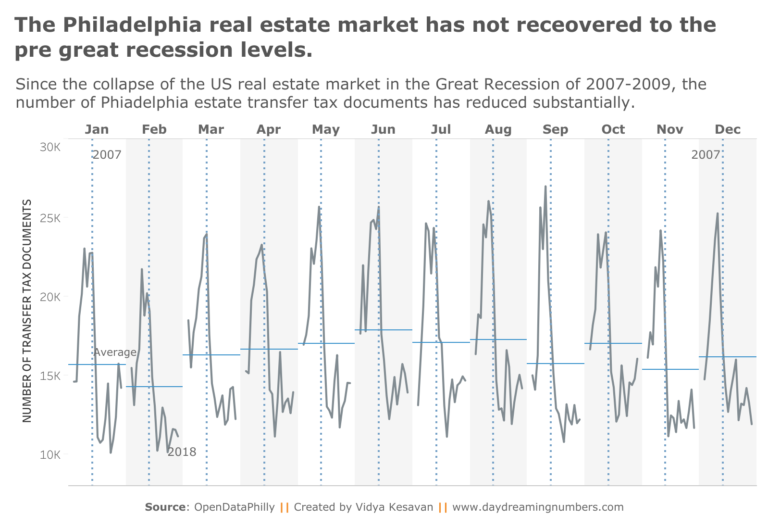
A cycle plot shows both days of the week/month of the year effect and trend/cycle in data. Cycle plots were created by Willian Cleveland and his colleagues in 1978 at Bell Labs.
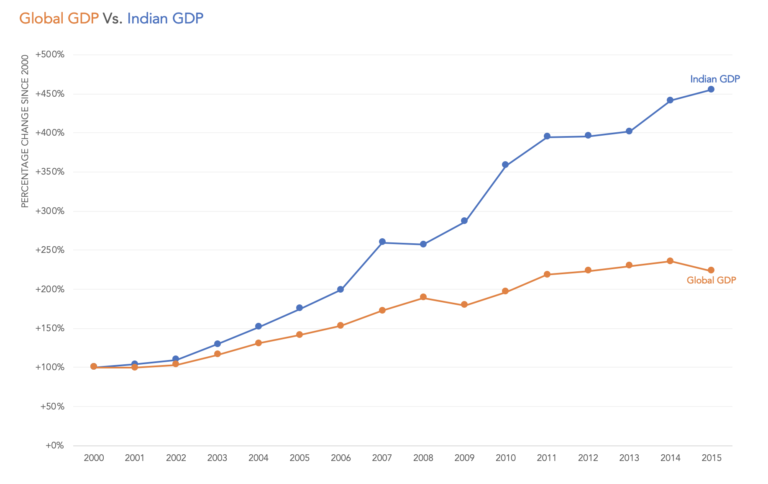
Indexing data is an effective method to normalize the data to a common starting point and observe how variables change over time relative to each other.
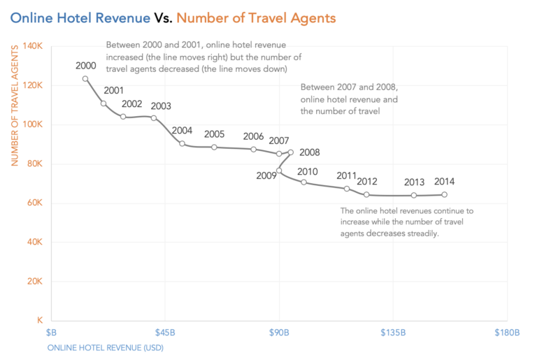
A connected scatterplot is a scatterplot with a third ordered variable used to connect the encoding between X and Y positions. This third variable is often time.

Let’s talk about what to use instead of dual axis charts. Here are 5 alternatives – Side-by-side charts. 2 charts labelled directly, Prioritizing and levelling, connected scatterplot and indexed charts.
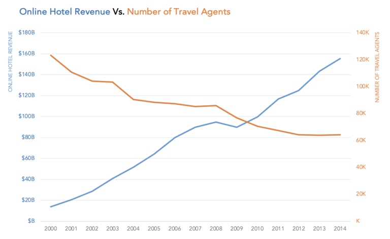
Like with most other charts, dual axis charts have their good and bad. They are often used to compare two data series in a small amount of space.
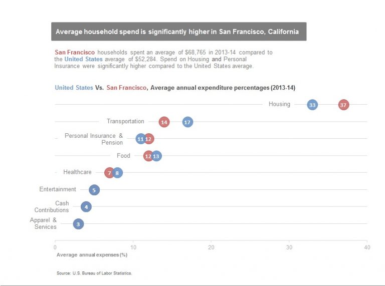
Dot plots use dots to represent the position of value on the axis. They are useful for comparisons and are a good replacement for bars or clustered bars.