Less is more: Declutter your charts!
Removing unnecessary elements when communicating with charts can greatly impact the effect the chart has on your audience. If a chart appears complex, we assume it is hard to read.
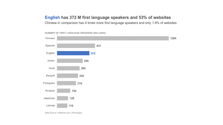
Removing unnecessary elements when communicating with charts can greatly impact the effect the chart has on your audience. If a chart appears complex, we assume it is hard to read.
Measures of variation describe the width of a distribution. They define how spread out the values are in a dataset. In this article, we will look at 4 measures of variation and when to use them.
The famous statistician John W. Tukey created a branch of data analysis called Exploratory Data Analysis. In exploratory data analysis we get familiar with data, ask questions, visualize data in a number of forms, look for relationships between the variables, look for outliers, patterns and trends in data. One way to do that is using measures…
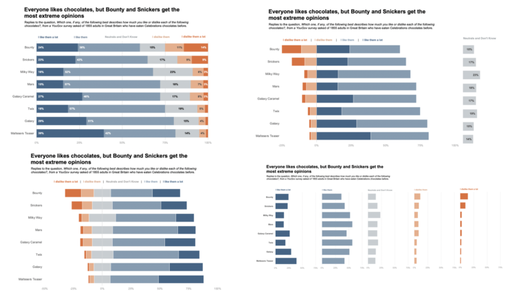
Halloween just went by and it is Diwali this week in India – which means there are a lot of sweets around. I am on a no-sugar diet now, so no candies or sweets for me. To satisfy my sweet tooth, I thought it would be fun to use a candy data set to learn…

Visualizing Survey Data Working back to back on 3 survey visualization projects, I have come to realise that visualizing survey data can be pretty standard for the most part. Yes, every dataset from a survey will be different and insights will be different. But the ways in which we can visualize survey data can be…
Gestalt is German for “Unified Whole”. Gestalt psychologists Max Wertheimer, Kurt Koffka and Wolfgang Kohler sought to understand how we humans make sense of what we see from the chaotic stimuli around us. Their findings were that we seek to form patterns, group objects in particular ways and simplify complex images. The main principle of…

When working with data, it is important to understand the purpose of data analysis. Though the end result of a data analysis process may be a single visualization, there are various stages this analysis goes through. Broadly, there are 2 types of data analysis: Exploratory analysis – Exploratory analysis is often the first step of…