Bullet Charts were developed by Stephen Few to replace the meters and gauges that are often used in business dashboards.
Here is one such dashboard from Oracle BI Discoverer tool.
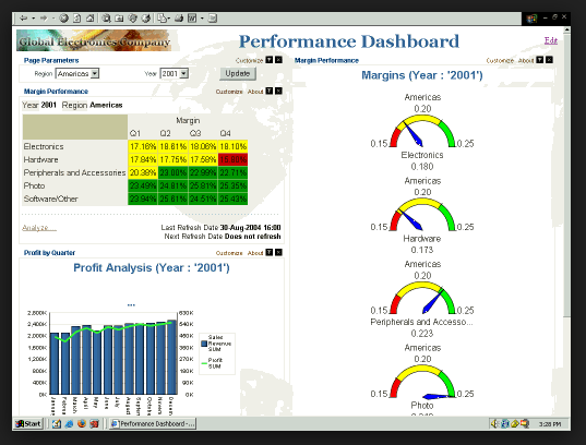
The idea of gauges and meters is borrowed from an automobile dashboard where they are used to display data in a small amount of space. Business dashboards too have a similar requirement. But business dashboards are also used for comparison and the gauge displays are not intuitive for comparison. The reasons are similar to why a pie chart is not good for comparison. We are not good at judging and comparing angles.
This is where the Bullet Charts come in handy. They are more efficient to read and compare values.
Let’s first understand what a Bullet Chart looks like.
Structure of a Bullet Chart

In a nutshell, there are 5 parts to a bullet chart:
- “High” background value
- “Medium” background value
- “Low” background value
- Target
- Actual Value or performance measure
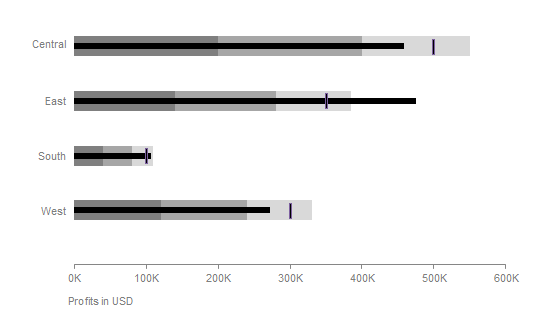
The high, medium, low background values are used as an indicator to denote the qualitative state. Is the performance good, satisfactory or bad? The leftmost measure represents low or bad and is shaded in dark grey. The right most measure represents high or good. These measures are an optional part of a bullet chart and they can be more or less than 3 in number.
The target value represents the goal or a comparative measure like the previous year’s sales. This is represented as a small vertical line in the bullet chart structure.
The actual value is the performance measure. This is the most important part of the chart as this is the data we are most interested in. The actual value is represented as a back bar in the diagram.
If you would like to understand in detail, Stephen Few has written a design specification for Bullet Charts.
Creating a Bullet Chart in Excel
Tools like Tableau provide an easy way to create a bullet chart. Excel does not come with a bullet chart option. It takes a few steps to create one. I tried 3 different methods to create a bullet chart in Excel and found the one on Excel Charts to be the easiest and flexible.
So here are the steps to create a Bullet Chart in Excel. We will start with creating a horizontal bullet chart.
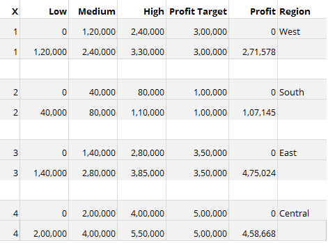
This is the data we will use for this example.
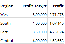
Let’s add some performance indicators to this. I am going to use Low, High, Medium indicators where Low is less than 40% of target, medium is 40-80% of target and high is 80-110% of target.
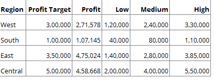
The data needs to be modified like this for the bullet chart
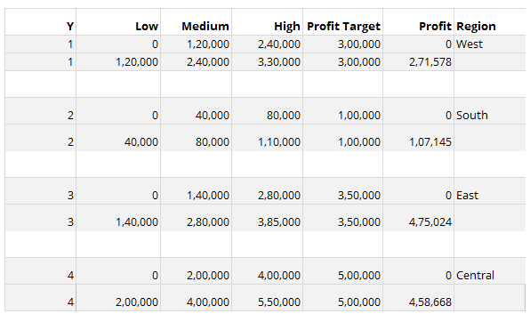
Once we understand the individual parts of the bullet chart, it becomes very easy to modify the data and create one.
The Y column represents the position of the bars in our final chart.
Low, medium and high are a stacked bar in our final bullet chart. What we have done is provide start and end points for the stacked bar. Medium starts where low ends, and high starts where medium ends.
Profit target is going to a vertical marker in our bullet chart. So it has the same start and end point.
The actual value of profit will be represented as a bar. The start point for the bar will be zero and the end point will be the profit value.
We will create the bullet chart for one row of data and then extend it to all others. This will save us time in customizing the chart.
To do this, the first step is to create named ranges. If you have never created one before, it is very simple. Let’s create a named range for the “High” column.
Select the label High.
Click on the top left Name Box, which will show the cell name currently.
Type in a new name, say HighT – This is the name for the range.
Press Enter.
Now select all the values under the High Label.
Click on the top left Name Box again, type in HighRan – This is the name for the range.
Press Enter.
Repeat these steps for Y, Medium, Low, Profit Target and Profit columns.
Next step is to hide all rows except the first 2.
Let’s start building the chart now.
Insert a scatter plot, right click and select data. We are going to add Low, Medium, High, Profit Target and Profit one by one to the scatter plot.
Let’s add “High” column first.
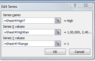
Note that we are using the range name we created in the last step.
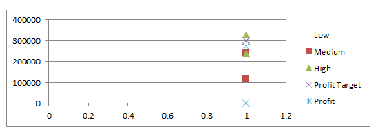
Once all the columns are added, you should have a chart that looks like this.
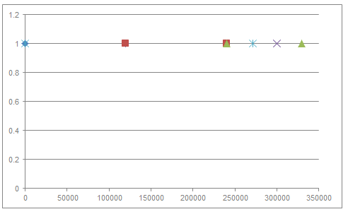
Now we will start building the stacked bar for the Low, medium, high section.
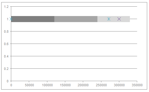
Select the Low series, right click and format data series.
Select Marker options -> None
Select a solid line color, which is dark grey in this case.
Change Line width to 15pt and Cap Type to Flat.
Repeat this for Medium and High series with different line colors.
Your chart will look something like this now.
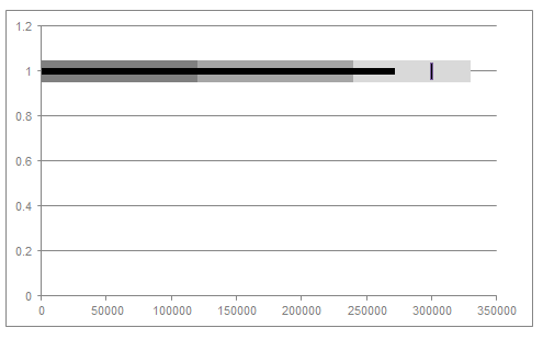
The next step is to change the profit value to a bar.
Follow the same steps as for high column, except change the line width to 5 pt and color to black.
We will change the profit target value to a vertical line. Since excel doesn’t have a vertical line marker, we will create one in paint.
Create a small image of 2*15 pixels and fill it with black color. Goto the marker options for profit value and use the image option to add the black line.
The chart should resemble this now.
Now all that’s left to do is some formatting. Remove the Y axis, unhide the rows in the data table and add labels to the bars and a horizontal axis.
Here is the final Bullet Chart.
Vertical Bullet Chart
Creating a vertical bullet chart is very similar, except interchanging the Series X and Series Y values while adding data to the scatter plot.
We start with the first 2 rows and build a scatter plot.
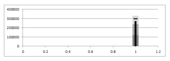
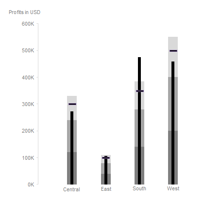
Change it to a bullet chart following the same steps as a horizontal chart. The only difference being, we do not need to create an image for the target value. Excel has a horizontal line marker. Just adjust the size as needed.
Unhide the rows and format the chart.
Here is the final Vertical Bullet Chart.
Did you find it easy to create a bullet chart in Excel? Have any questions or comments? Let me know in the comments section below.

