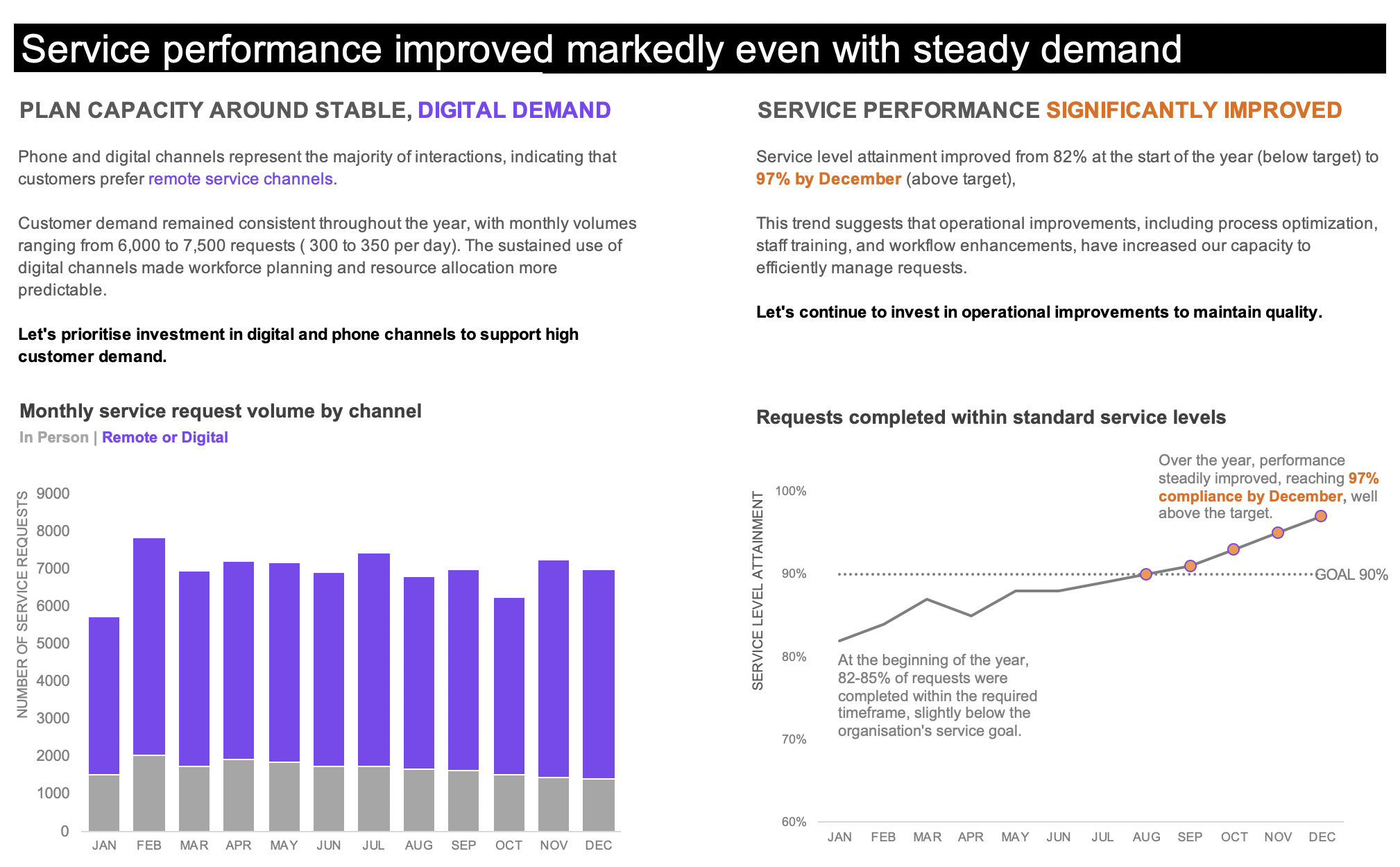
From operational dashboard to an executive slide
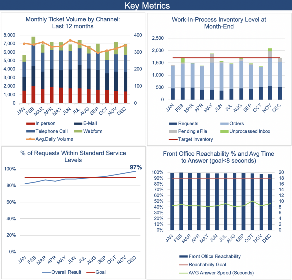
Challenge: Distill a multi-chart operational dashboard into a single executive slide that communicates operational health and enables decision making.
Design decisions: Most operational dashboards are designed for exploration, not decision making. I transformed a dense monitoring tool into a narrative by asking the question: “Can the organisation maintain service quality while managing a steady customer demand?”
I selected 2 critical metrics: Monthly ticket volume by channel and percentage of requests within service standard levels. I paired these 2 charts with interpretive text that explains what executives should focus on and what actions they should take.
The result: The redesign shifts a monitoring tool to a self standing actionable insight. Executives get clear inputs on where the organisation stands, what action they should take and why, enabling faster strategic decisions.
Tools: Microsoft Excel