How to show time series data with incomplete period
When working with time series data, one of the most common challenges analysts face is dealing with incomplete time periods. Imagine tracking yearly revenue, quarterly sales, monthly website traffic or weekly customer sign ups and the latest period isn’t finished yet. If you simply plot the data as is, the incomplete period can look like a sudden drop, misleading stakeholders and causing a lot of panic. If you omit the current data, you are missing valuable early signals and not showing the complete picture.
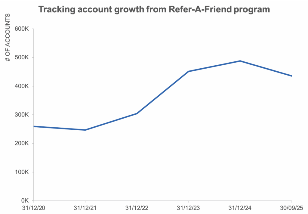
Data and inspiration for this article comes from this SWD Exercise. The original chart shows the number of new accounts that a company has acquired annually via a promotional program called “Refer-A-Friend”. You can notice how there is a dip in the referrals in 2025, however the data reflects only till September 2025.
We explore 5 strategies to visualize time series with incomplete periods in a way that preserves clarity and avoids misinterpretation. By the end you’ll see how thoughtful choices and like-for-like comparison can turn a potential pitfall into an opportunity for transparent data storytelling.
1 – Annotate the incomplete period
Annotating the incomplete period is one of the simplest yet most powerful ways to prevent misunderstanding in time series charts with incomplete period. When the latest quarter or month is only partially complete, viewers may misinterpret the unfinished data as a sudden decline in performance. To avoid this, it helps to make the incompleteness explicit.
One way to do that is to add an annotation to the footnote and/or the axis.
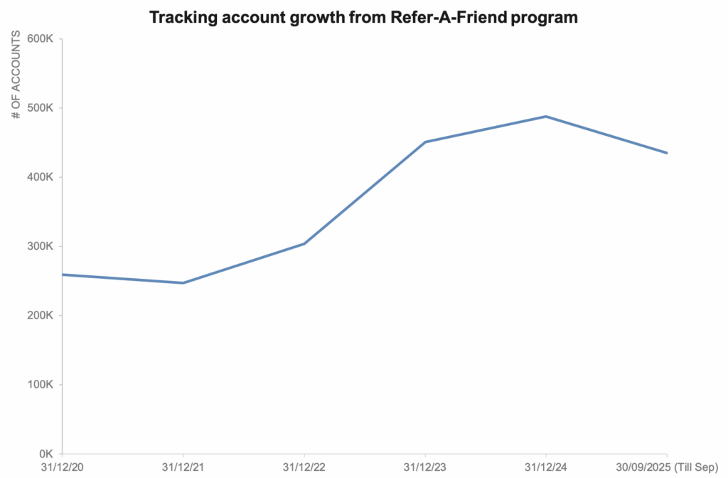
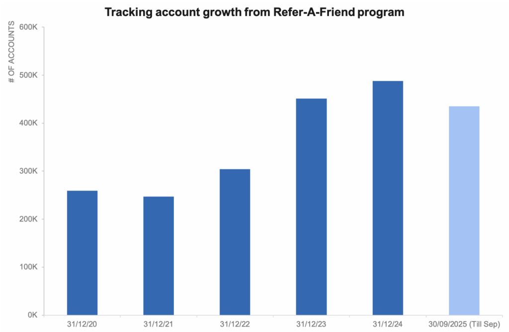
This way we preserve trust in the chart and ensure that the audiences focus on the underlying trends without being distracted by what looks like a drop.
When to use this strategy
Use this when you want to show incomplete time period but want to avoid misinterpretation, like in executive dashboards
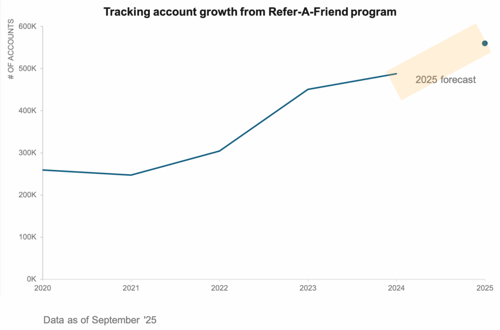
2 – Add an estimate for the missing period
When the last quarter or month is still in progress, leaving it blank can make the chart feel unfinished, while showing partial data risks misinterpretation. By adding a carefully calculated estimate, you provide viewers with a sense of continuity and help them see the bigger picture. This estimate might be based on historical averages, seasonal patterns or early partial data extrapolated for the rest of the period. The key is to label the estimate, so the audience understands it is a forecast rather than actual.
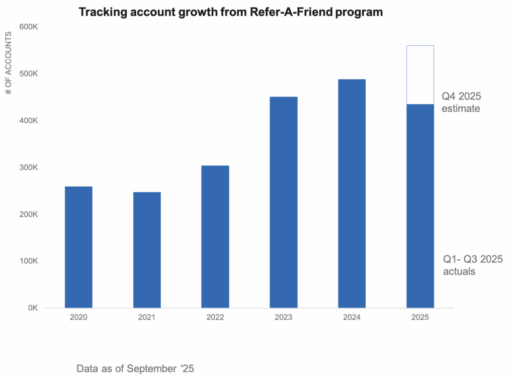
In this example, we have used labels to clearly call out the estimated value along with a different fill to draw the viewer’s attention. Done well, this approach ensures the chart remains accurate and actionable.
In a line chart, we could use dotted lines along with clear labels to show the forecast period.
When to use this strategy
Use this when your audience needs to see the entire period to make decisions, even if the data isn’t fully available yet. It is especially effective in forecasting discussions, budget planning or performance reviews where leaving the chart incomplete could stall discussions.
3 – Show a like for like comparison
Showing a like for like comparison is a great way to keep incomplete periods in context without misleading your audience. When the current year’s Q4 data is only partially available, comparing it directly to previous year’s full Q4 data can distort the story. Instead, we can aggregate all historical years upto Q3 and show Q4 separately in a stacked column chart. This allows that the comparison across years is fair and consistent while still allowing Q4 to be visible asa separate segment. We can use any of the methods suggested above to estimate Q4 values accurately and label it so that the audience knows it is a forecast.
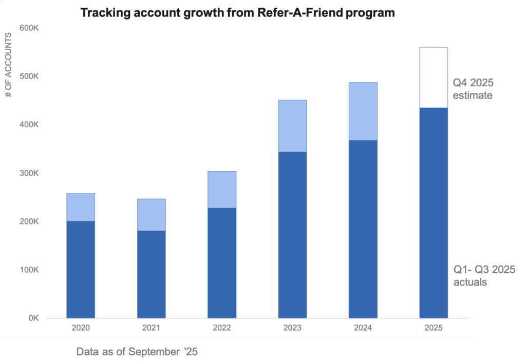
This approach highlights the like for like comparison across years while still giving stakeholders a forward looking view of how the year might close.
When to use this strategy
Use this when you need to compare performance across multiple years, but the current year’s data is incomplete. By aggregating all years upto Q3 and isolating Q4, you prevent incomplete data from skewing the story while still giving visibility into how the year might finish.
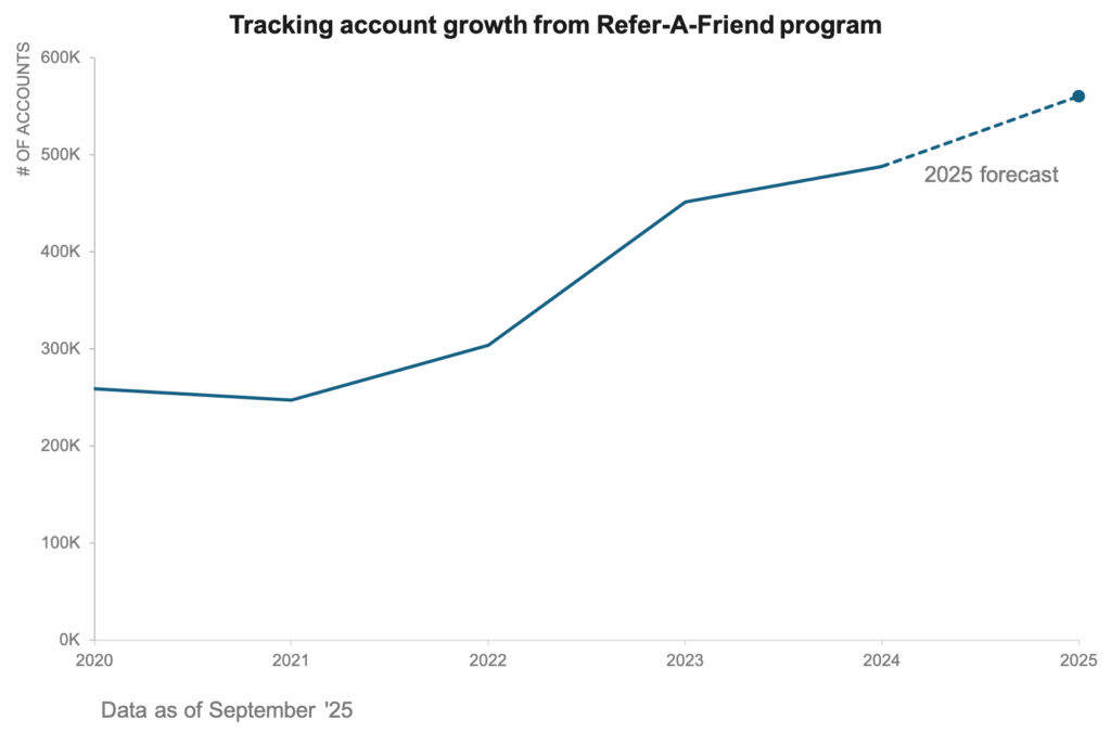
4 – Use a break in the line chart
When we connect incomplete data points directly to an actual trend, the chart can imply continuity that doesn’t actually exist. This can mislead viewer’s into thinking the forecast is confirmed. Instead we introduce a visual break – we stop the line at the last fully complete period and then represent the forecast differently.
One option is to shade the forecast area in a different colour creating a transparent band that signals uncertainty.
Another option is the plot the forecasted values as standalone dots without connecting them to the historical line, making it obvious that these are projections rather than actuals.
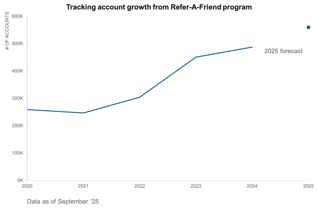
Both these approaches preserve the integrity of data while still giving the audience a forward looking view. By visually separating the actuals from the forecast, we ensure that our chart tells a transparent story what is known and what is estimated.
When to use this strategy
Use this when the audience needs to see exactly where the data ends and assumptions begin. This approach helps you make a clear distinction between confirmed results and forecasted values.
5 – Show all of the data
We can also show all the data by plotting every month from the historical years in a multiple line chart. This allows users to see how each year unfolded in the past. They are better able to see seasonal patterns, recurring peaks or shifts in momentum.
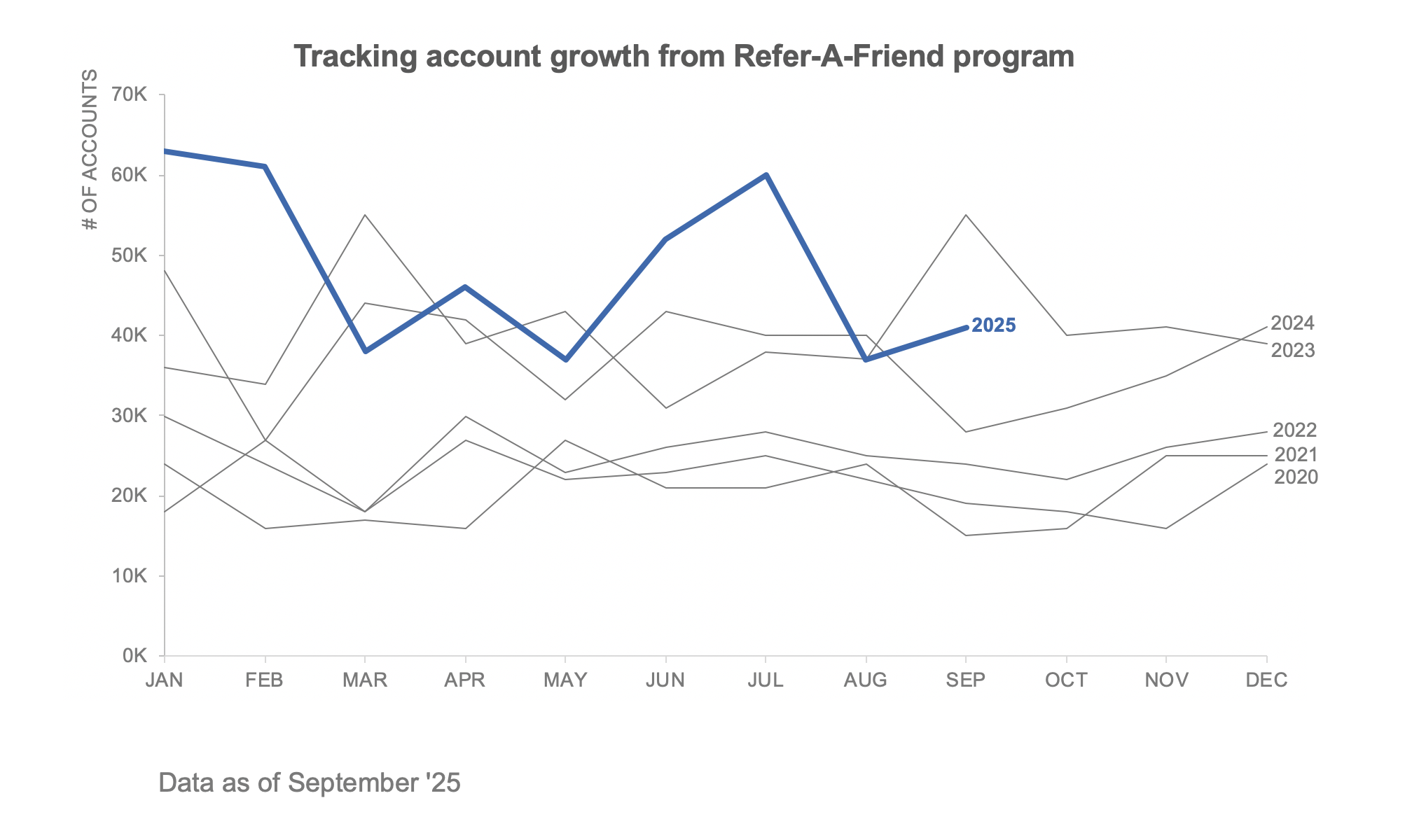
The real advantage of this method is that it makes incomplete periods easier to interpret. When the current year stops in September, we can easily compare its trajectory to the same point in the previous years.
At the same time, this approach can be visually dense and sometimes confusing, if too many lines overlap. Clarity in design is essential and done thoughtfully, this approach can balance detail with context turning incomplete data into meaningful comparison.
When to use this strategy
Use this approach when you want to highlight seasonality and add context to incomplete periods. It works best in marketing performance analysis, for example, where audience benefit from seeing how current performance compares to the same stage in prior years. This strategy is particularly useful when the goal is to assure stakeholders that a mid dip or rise is consistent with prior patterns.
And there you have it – 5 smart ways to highlight incomplete periods in your time-series data. At its core, data visualization is about helping people understand what’s really happening with the data. Incomplete time periods don’t have be a source of confusion. With the right design choices, you can guide your audience through the uncertainty, ensuring they walk away with insights they can act on.
Which of these approaches have you tried in your own dashboards or reports? I’d love to hear how you handle incomplete periods.
 Annotate
 Estimate
 Compare like for like
 Break in line
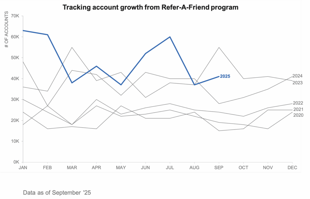 Show all the data