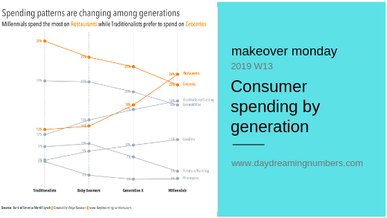
Makeover Monday: Consumer spending by generation

The challenge with stacked bar charts is that if there is something interesting happening further up the stack, it becomes difficult to see because it is stacked on top of other things that are also changing. In this chart, with 7 different colours, it is hard to understand what's going on.

0 Comments

#SWDChallenge: a makeover

The #SWDChallenge this month is a makeover project. The challenge instructions come with a wonderful article by Elizabeth Ricks of SWD on the art of undertaking chart makeovers. I found the article very insightful and I took a lot of notes. In a nutshell, here are a few steps to get started with doing "good…

0 Comments
Read more about the article Comparing change through time
time-for-a-change

Comparing change through time

A clustered bar chart is one of the most commonly used representations to compare change through time. A clustered bar chart, though a good option to compare values, does not represent the change through time effectively. Here is some data on which technology products consumers intend to buy in 2016 and how it compares against…

0 Comments