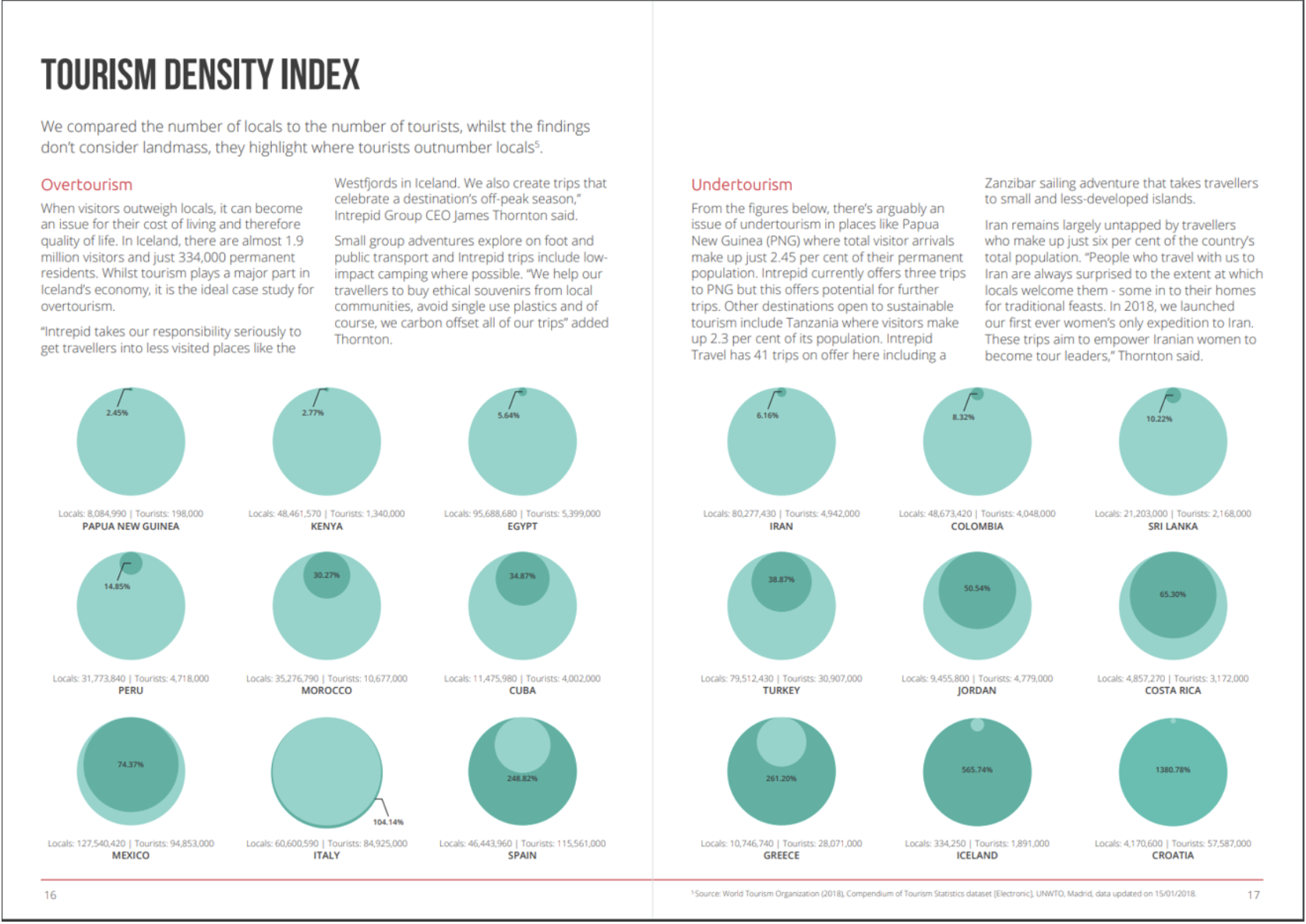
Overtourism Vs Undertourism
Dataset
The dataset for MakeOverMonday project is hosted on data.world.
Original Visualization
What works in the original visualization?
- The visual represents the overtourism and undertoursim magnitudes in a single graph.
- The terms overtourism and undertourism are explained well.
What doesn’t work in the original visualization?
- Circular shapes are not best suited for comparison and I found myself referring to the number to compare.
- As the percentage increases over 100, the sudden swap of light and dark green is confusing.
My redesign goals
In the redesign I wanted to make sense of what these numbers mean? Are there more tourists in certain parts of the world than others? Another way of looking at this data would be in terms of raw number of locals and tourists. But I was more interested in seeing if there are any geographical patterns to the tourism density index. Hence I decided to go with a map representation.
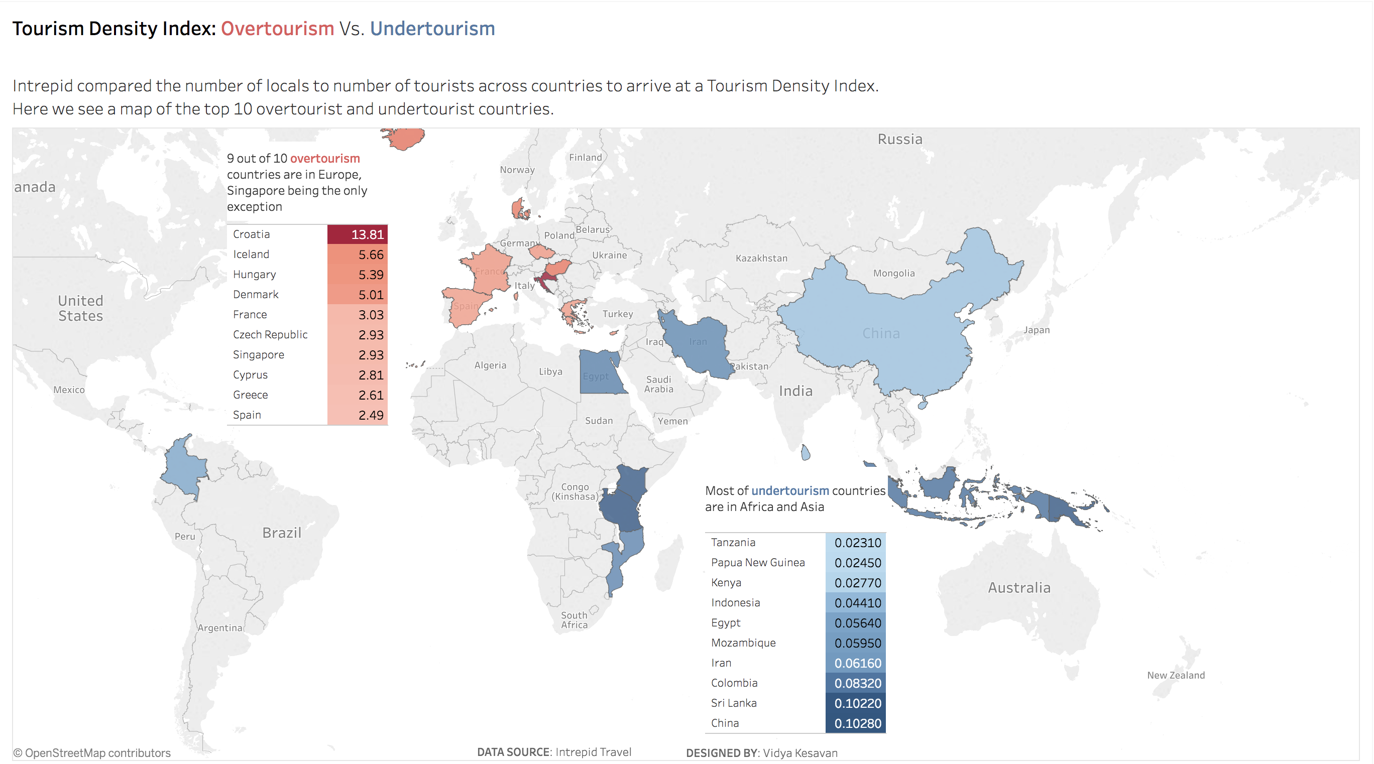
[Click to view enlarged image]
View an interactive version in my Tableau Profile.
The challenge with the map representation was that the visualization lost the ordering capability that a bar chart intrinsically has. So I created a table of the tourists to locals ratio to show the order. The map shows the geographical pattern, the table shows the order and these are tied together by the use of same colour.


This is a very good redesign. Much, much better than the original. Keep up the good work!