Original
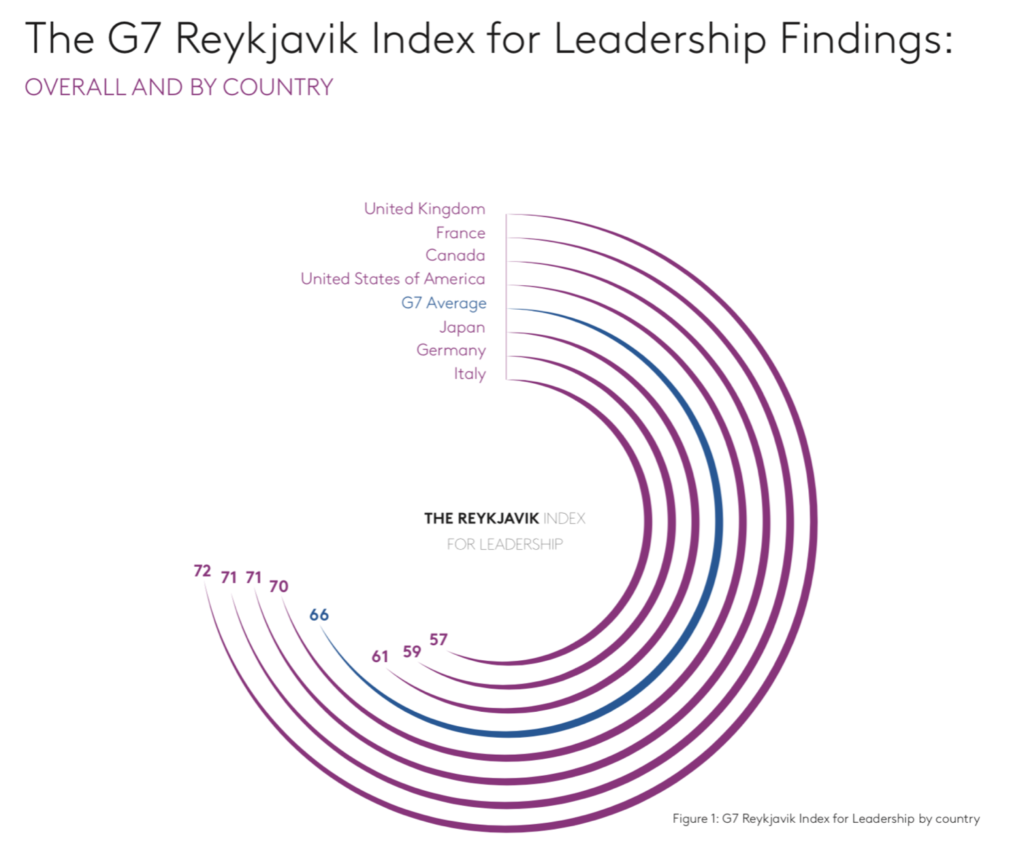
Analysis of the original
Here are a series of questions I use to analyse a chart.
- Where are my eyes drawn?: My eyes are drawn to the blue arc for G7 average.
- What works in this visual?: The circular bars are sorted. Good use of colors to represent countries and average.
- Identify clutter, make note of anything you find confusing: Circular/radial bar charts look cool but are very hard to read. The bar lengths can be misleading because each bar is judged by its angle, not length.
- Is the take-away action clear?: No, there is no takeaway action
- Are pre attentive attributes used to draw user’s attention?: The use of a different color for G7 average draws user’s attention to the average.
Makeover
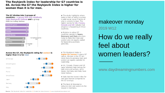
For this makeover, I chose to focus on 2 messages.
- The Raykjavik index for individual countries compared to average and the goal.
- The gender dissonance in Reykjavik index.
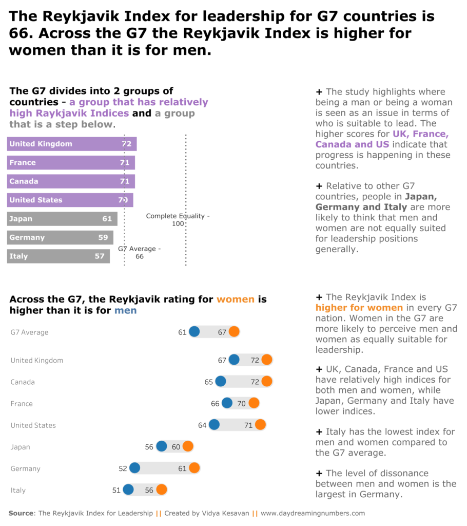
To show the Reykjavik index for individual countries, I used a simple bar chart but formatted it to have labels and values on the bars.
For the gender dissonance I used a range plot.
If you want to try own makeover, here is the data.