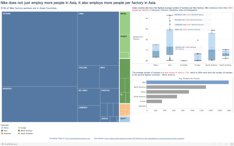
Projects

MakeOverMonday – How many women have constructed crosswords for The New York Times?

MakeOverMonday – How many women have constructed crosswords for The New York Times?

This week’s MakeOverMonday dataset comes from XWord Info. Here is the original graph What works well? The title is clear. The time is alone the X-axis, which is how we normally visualize time. What could be better? The 7 lines create a spaghetti effect. It is not easy to see the trend of a single…

Paying the President – MakeOverMonday

Paying the President – MakeOverMonday

This week’s MakeOverMonday challenge is a dataset from the website ProPublica. ProPublica tracked down political and taxpayer spending at Trump properties since Trump declared his candidacy in late 2015, to May 2018. From ProPublica: Since Watergate, presidents have actively sought to avoid conflicts between their public responsibilities and their private interests. Every president since Jimmy…

#SWDChallenge: a makeover

#SWDChallenge: a makeover

The #SWDChallenge this month is a makeover project. The challenge instructions come with a wonderful article by Elizabeth Ricks of SWD on the art of undertaking chart makeovers. I found the article very insightful and I took a lot of notes. In a nutshell, here are a few steps to get started with doing “good…

Nike in Asia – Visualization project

Nike in Asia – Visualization project

This visualization project was created as part of the MakeOverMonday project. Dataset The dataset for this project is hosted on Data.world The original visualization My goals with this visualization project: My main goal with this project was to make it Explanatory. I set out to answer these questions with this project: Where does Nike have the most number…

How diverse are the Silicon Valley Technology Companies?

How diverse are the Silicon Valley Technology Companies?

Reporters from the Center for Investigative Reporting sought employee diversity data from 211 technology companies in San Fransisco. A couple of dozen companies shared their data. Here is a visualization of how race and gender diversity for 23 companies in Silicon Valley. The data was analysed using R and the visualization is using d3.js.